What Are Pastel Colors?
Pastel colors refer to soft, light hues created by mixing pure colors with white, resulting in reduced saturation and high lightness. They are often associated with calmness and elegance.
Key Characteristics of Pastel Colors
- Low saturation: Colors appear muted and gentle, avoiding vibrant or intense tones.
- High value: High in lightness, making them bright yet soft.
- Versatility: Suitable for various contexts, like minimalistic or vintage designs.
Common Examples and Uses
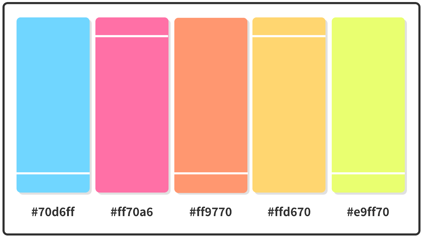
Examples include baby blue, mint green, and blush pink. In applications:
- Interior design: Creates serene environments; ideal for walls or décor.
- Fashion and branding: Conveys softness; used in logos or clothing for a soothing appeal.
- Digital art: Enhances visual themes; popular in web design for readability.
How to Identify and Work with Pastels
Identify them through their low chroma on color wheels. For professional use:
- Use complementary colors for contrast without overwhelming.
- Maintain accessibility; ensure sufficient contrast for readability.