Effectively combining yellow and blue in logo design leverages high contrast and powerful psychological associations. Follow these focused strategies for impactful results:
Master the Color Balance
Yellow commands attention but can overwhelm. Blue provides stability. Prioritize blue as the dominant hue (60-70%) for trustworthiness. Use yellow strategically (20-30%) for highlights, accents, or key elements like an icon, ensuring it pops without dominating. Avoid 50/50 splits unless deliberately creating tension for a specific concept.
Leverage Psychology & Context
Understand what these colors communicate:
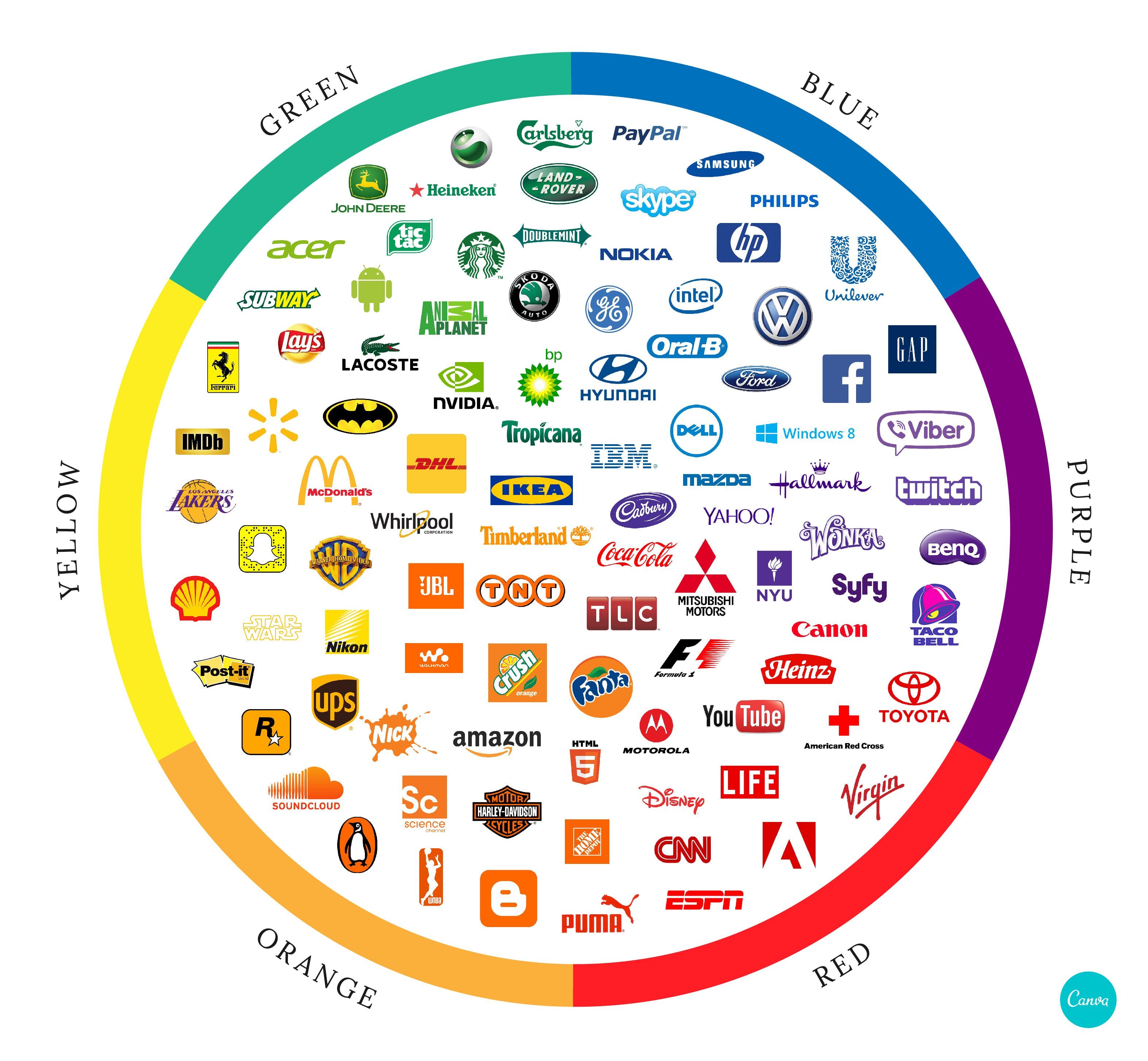
- Yellow: Optimism, energy, creativity, warmth, caution (context-dependent).
- Blue: Trust, reliability, professionalism, calm, security.
Align combinations with your brand personality. A bright yellow sun against deep blue signals innovation and dependability. Muted navy with golden yellow suggests sophisticated expertise.
Ensure Practical Adaptability
Test applications rigorously:
- Contrast for Visibility: Ensure the chosen shades offer sufficient contrast for legibility at small sizes (e.g., favicons, app icons). Avoid light blue/yellow or overly similar tones.
- Grayscale Integrity: Verify the logo remains clear and recognizable when converted to black and white or single-color versions. Shapes and composition must carry the design.
- Reproduction Consistency: Define specific Pantone or CMYK formulas for each color to guarantee consistency across all materials, from digital screens to printed merchandise.