Common Flag Design Mistakes
Avoid these frequent errors to ensure your flag resonates visually and symbolically:
- Overly complex details: Tiny icons or intricate patterns become indistinguishable when scaled down, weakening impact from a distance.
- Poor color contrast: Similar hues like dark blue against black reduce legibility, especially in low-light conditions.
- Ignoring scalability: Complex gradients or fine lines blur when printed on fabric or viewed from afar, distorting the intended message.
- Excessive text or letters: Words crowd the design and fail to translate universally across languages or cultures.
- Symbolic ambiguity: Unclear or culturally insensitive imagery risks misinterpretation or offense.
Expert Advice for Flawless Designs
Apply these strategies to craft memorable, functional flags:
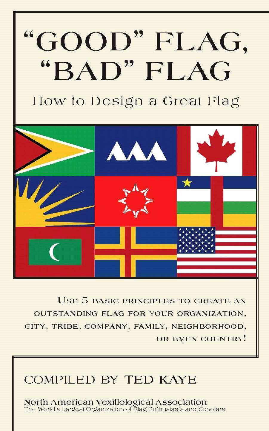
Prioritize simplicity: Use bold, minimal shapes that scale cleanly. Aim for 2–3 core elements—think Japan's red circle or Canada's maple leaf.
Optimize color theory: Select high-contrast palettes (e.g., red/white or blue/yellow) and test visibility in sun, rain, and wind. Limit colors to three for cohesion.
Balance symbolism and functionality: Ensure symbols are timeless and culturally inclusive. Avoid trends; focus on universal themes like nature or unity.
Test extensively: Digitally mock up designs at various sizes—fly them in wind simulations or print small samples to confirm readability and durability.
Embrace negative space: Use blank areas to amplify key elements, as seen in South Korea's yin-yang flag, which emphasizes harmony through spacing.