Understanding "Focus Sans"
The term "focus sans" generally refers to sans-serif typefaces chosen or designed for their ability to enhance readability, clarity, and maintain user attention. These fonts aim to minimize visual fatigue and cognitive load, making them particularly suitable for tasks requiring prolonged concentration or the clear presentation of information.
Key Characteristics
Sans-serif fonts that promote focus typically exhibit several distinct qualities:
- High Legibility: This is paramount. Letterforms are distinct, unambiguous, and easily recognizable, even at smaller sizes or lower resolutions. Open apertures (e.g., in 'c', 'e', 's') and generous spacing contribute to this.
- Neutrality and Simplicity: They tend to have a clean, unembellished aesthetic, avoiding overtly stylistic or distracting features. The design supports the content without calling undue attention to itself.
- Generous X-Height: A larger x-height (the height of the main body of lowercase letters) often improves readability by making lowercase characters appear more substantial and clearer relative to uppercase letters.
- Adequate Spacing: Well-considered letter spacing (tracking) and word spacing are crucial for a smooth reading rhythm and to prevent characters from visually merging.
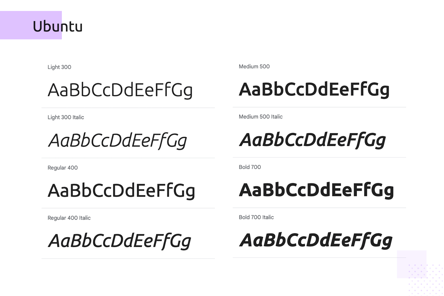
- Versatility in Weight and Style: While the core design is simple, a good family might offer a range of weights (light, regular, bold) to create hierarchy without resorting to overly complex or decorative alternatives.
- Optical Clarity: The design avoids fine details that might degrade on screens or in print, ensuring crisp rendering.
Typical Use Cases
Fonts embodying "focus sans" principles are frequently employed in:

- User Interfaces (UI): For software, websites, and mobile applications where clear navigation and information display are critical.
- Long-Form Reading: Digital articles, e-books, and academic papers where sustained reading is required.
- Technical Documentation: Manuals, reports, and instructional materials that demand precision.
- Data Visualization: Charts, graphs, and dashboards where labels and numbers must be instantly legible.
- Educational Materials: Textbooks and learning platforms designed for optimal comprehension.
Considerations for Selection
When selecting a "focus sans" typeface, consider the specific medium (print vs. screen), the target audience, and the nature of the content. Test the font in its intended context to ensure it meets the desired criteria for clarity and unobtrusiveness, ultimately supporting the user's ability to concentrate on the information being presented.


