Burberry has unveiled a transformative visual identity, representing a significant evolution from its heritage. This rebrand aligns with Daniel Lee's appointment as Creative Director, focusing on modernity and global relevance.
Key Changes in the Visual Identity
The update emphasizes simplicity and boldness:
- Logo Overhaul: The classic knight emblem was streamlined, removing "London" text for a cleaner, more versatile look, instantly recognizable yet contemporary.
- Typography Shift: Introducing "Burberry Bold" as the primary typeface, it offers enhanced legibility and a dynamic feel across digital and physical touchpoints.
- Color Strategy: A refreshed palette with "Knight Blue" as the anchor hue brings vibrancy and sophistication, complementing the brand's British heritage.
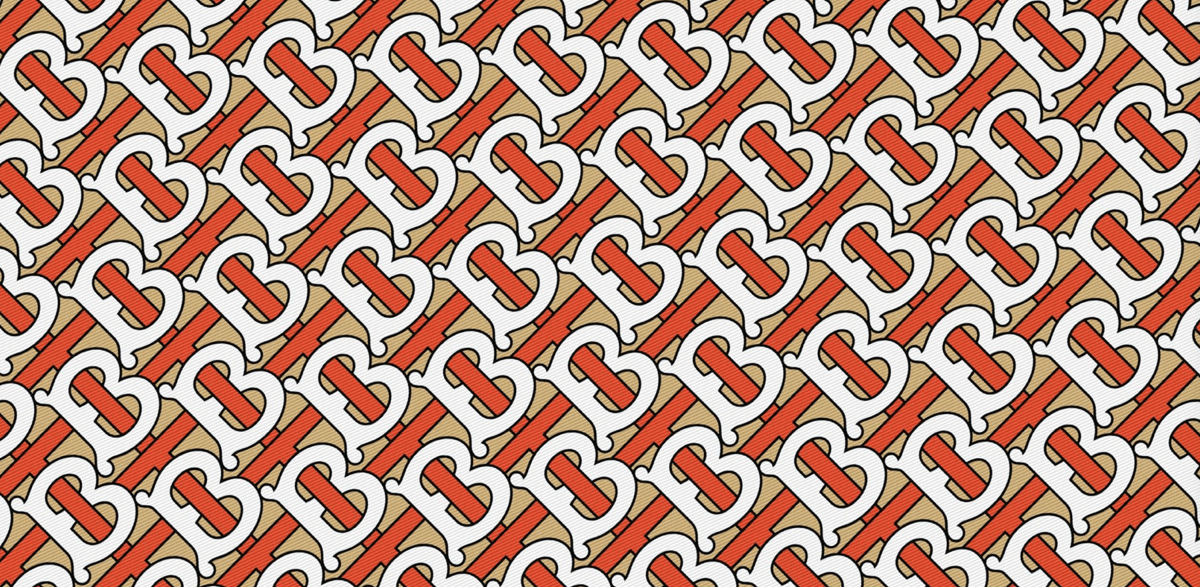
- Imagery and Patterns: Updated iconography and reinvigorated tartan motifs reflect a fusion of tradition and innovation, optimized for omni-channel consistency.
Strategic Implications
This rebrand drives Burberry's growth strategy: it targets younger demographics and digital-first consumers, reinforcing innovation while preserving legacy. Early market reception highlights its potential to boost engagement and sales.
Overall, the new identity positions Burberry for sustained luxury leadership.