The 2012 London Olympics logo, officially named "London 2012", was a bold, groundbreaking design by brand consultancy Wolff Olins, unveiled in 2007. Its purpose was to signify a modern, energetic, and inclusive Games.
Breaking Down the Design
Visually distinct, the logo featured:
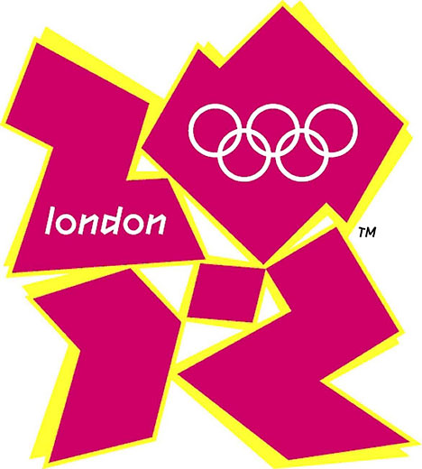
- Angular, Jagged Shapes: It consisted of abstract pink, orange, blue, and green shards forming a rough, dynamic number "2012".
- Embedded Text: The word "LONDON" was integrated within the number "2".
- Vibrant Colors: The base pink/orange palette was energetic; a distinct magenta became known as "London Pink". Different color combinations were used for the Olympics and Paralympics branding.
The Cool Meaning & Core Ideas
Its radical departure aimed to convey several key concepts:
- Disruption & Transformation: It challenged traditional Olympic aesthetics, symbolizing London's modern, cutting-edge spirit and the idea of the Games transforming the city and inspiring youth.
- Dynamism & Energy: The sharp edges and irregular form evoked movement, youthfulness, and the unpredictable energy of the Games.
- Inclusivity & Participation: The abstract form wasn't prescriptive; it was designed to be "open source" – adaptable and inviting interpretation from diverse audiences. The embedded "LONDON" required viewer engagement to spot it.
- Flexibility: The logo wasn't a static icon. Its core framework was meant to be animated dynamically, adapting and morphing for different contexts and promotions, symbolizing the journey towards 2012.
- Modern Britain: Represented contemporary, multicultural London and the UK as vibrant and forward-thinking.
The Controversial Story
The logo's launch was met with significant public controversy:
- Initial Shock: Its abstract, jagged style was jarring compared to traditional serene Olympic imagery. Many found it chaotic or unattractive initially.
- Online Backlash: Negative online comments proliferated, and an online petition called for its scrapping.
- Animated Strobe Issue: The initial animated sequence triggered concerns about epileptic seizures and was quickly modified.
Despite the rocky start, the design team and organizers held firm. They believed its boldness represented the Games' mission to "Inspire a Generation" through an unconventional lens. Over time, especially through extensive and creative applications in animation, merchandise, venue dressing, and events, the logo gained recognition and served its purpose effectively, becoming an unmistakable symbol of London 2012.
In essence, the London 2012 logo was a deliberate, high-risk statement piece. It prioritized symbolism around modernity, energy, and inclusivity over classical aesthetics, leaving a lasting (if polarizing) mark on Olympic design history.